In this guide, I’ll show you, step-by-step, how to create a full-width background image section in the WordPress Block Editor with boxed-width content.
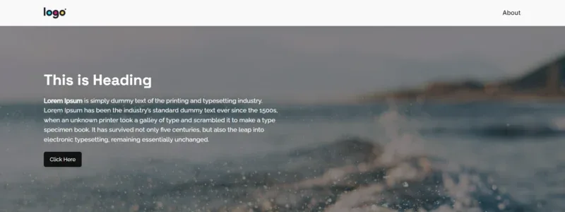
By the end, your section will look like the one below.

Table of Contents
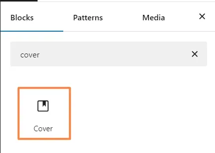
Step 1: Add the Cover Block
Open the Block Editor, and add the Cover Block.
Select the background image or color you want for this section.
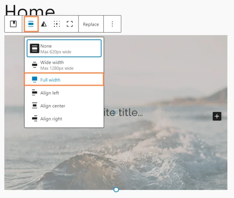
Select the Cover block again, from the top toolbar, click on the Align icon, and select Full Width. This will make the section span the entire width of the screen.
Step 2: Adjust the Style
Now that our section is full-width, we can adjust its style to make it look just right.
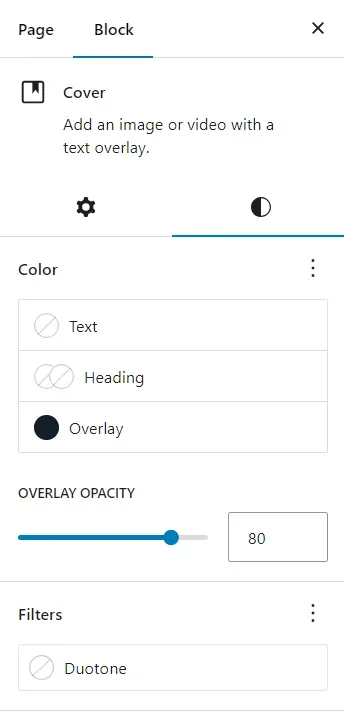
To do this, go to the Style Tab from the side panel.
We can adjust section height, overlay color, overlay opacity, image position, and more. Play with it.
Step 3: Create the Content Container
Since we want the background to be full-width but not the content, we need to set a maximum width.
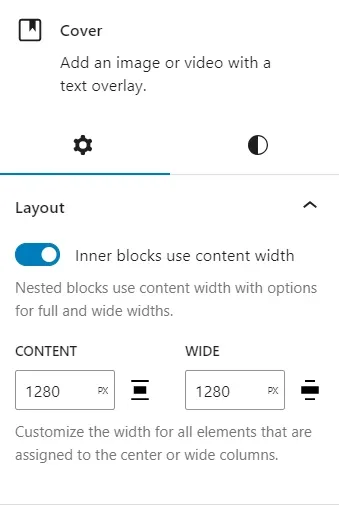
To do that, go to the Cover Block settings in the side panel, and set the Content Width to match the max width of your website’s content area.
Example: If your body has a max width of 1280px, use that here.
We’re not done yet. If we add content to the section now, the text or paragraphs will take up the entire content width we set.
However, we only want it to take up half of that space. To achieve this, we need to add columns.
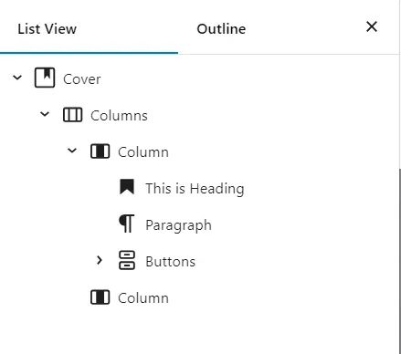
Delete any blocks inside the Cover block if you have them, then add a 50/50 column layout. In the left column, you can start adding your content.

If you need a different layout, add columns based on your design preferences.
This is how the layout should look with left-aligned content.
Once everything is set, click Save and preview the page. The section will also look good on mobile.
If you have any questions, feel free to leave a comment below. I will try my best to answer.

