In the WooCommerce My Account page, the navigation menu for account pages is placed vertically by default. If you want to give it a cleaner look, making the navigation horizontal is a great option.
In this guide, I’ll show you how to do that easily using only CSS. It will also be responsive to mobile and tablet devices.
Your My Account page will look like this at the end of tutorials.

Let’s start.
Table of Contents
Code Snippet to Make My Account Navigation Menu Horizontal
Copy the code below and add it to your theme’s style.css file.
/*
 * Snippet: CSS to Make WooCommerce My Account Navigation Menu Horizontal
 * Author: Toufique Alahi
 * URL: https://wpblogr.com
 * Tested with WooCommerce 9.3.3
 */

/* Main container for the whole content */
.woocommerce {
   display: flex;
   flex-direction: column;
   width: 75% !important; /* Adjust the width of the page as needed */
   margin: auto;
}

/* Style the navigation menu on the My Account page */
nav.woocommerce-MyAccount-navigation ul {
   display: flex;
   flex-direction: row;
   justify-content: space-between; /* Adjust the spacing between menu items */
}

/* Centers the page title, remove this if not needed */
body.woocommerce-account [itemprop="headline"] {
   text-align: center;
}

/* Overrides the theme's CSS for the elements */
.woocommerce> :nth-child(1),
.woocommerce> :nth-child(2) {
   width: 100% !important;
   float: none !important;
}

/* Adds margin between the menu and content */
.woocommerce-MyAccount-content {
   margin-top: 3%; /* Adjust the margin as needed */
}

/* Media query for mobile and tablet view */
@media (max-width: 768px) {

   nav.woocommerce-MyAccount-navigation ul {
      flex-direction: column; /* Stack menu vertically on smaller screens */
   }

   /* Adjust container width for smaller screens */
   .woocommerce {
      width: 90% !important; /* Adjust the width as needed */
   }
}
Code Explanation
.woocommerce {}: This container holds the navigation menu and content div. We’re using a flexbox layout to ensure the horizontal layout.
The width is limited to 75% for a cleaner, centered look. You can change the width as needed. It won’t affect the horizontal alignment of the divs.
nav.woocommerce-MyAccount-navigation ul {}: This code makes the menu items horizontal and aligns them in a row. By default, they are vertical. The justify-content: space-between evenly spaces the items.
You can change this to fit your design. For example, use justify-content: center to center the items and add gap: to control the spacing between them.
body.woocommerce-account [itemprop="headline"] {}: This centers the page title on the My Account page, matching the design. Remove it if you don’t have a page title.
.woocommerce> :nth-child(1), .woocommerce> :nth-child(2) {}: This code overrides any theme styles for the navigation menu and content div. It ensures that both divs take up the full width.
If the code doesn’t work as expected for your theme, it may be because this class cannot override the theme styles properly. For most themes, this code works perfectly.
.woocommerce-MyAccount-content {}: This code adds a margin-top to the My Account content section. It creates space between the content and the navigation menu. You can adjust the margin value as needed.
@media (max-width: 768px) {}: This code keeps the layout responsive. On tablets and mobile phones, the navigation changes to a vertical layout, and the container width increases to 90% for better readability.
How to Add the Code Snippet
You should add the code snippet to the style.css file in your child theme. If you don’t have a child theme, read this guide on How to Create a Child Theme.
Once you have the child theme, follow these steps:
- Go to your WordPress dashboard.
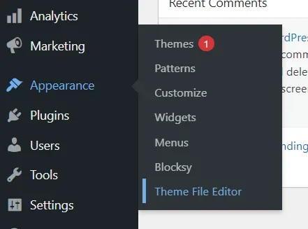
- Hover over Appearance and click on Theme File Editor.

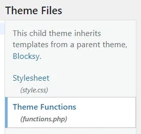
- On the right side, find
functions.phpandstyle.css - Click on file names to add the code.

Paste the code and click on Update File.
I wrote the code in a way to work with most themes. I tested it with several themes, and the menu displayed as expected.
If it doesn’t work for you for any reason, feel free to leave a comment below. I’ll do my best to assist you.


